

Did you know that 68% of global teams say raw web analytics slow their response time to market changes? That gap forces delays and missed chances.
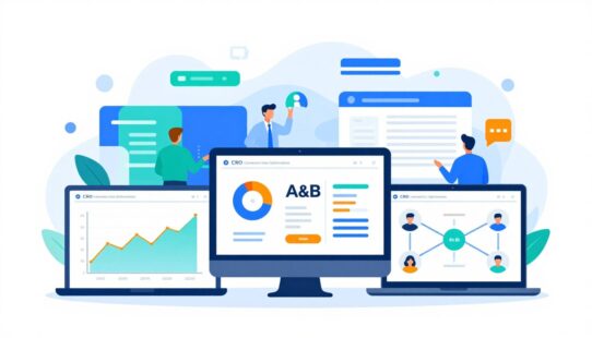
Today, a single dashboard can convert Google Analytics and other raw data into clear, actionable insights. It gives teams real-time visibility so they monitor trends and act fast.
This guide previews how a consolidated view reduces time spent assembling reports and boosts alignment across teams. It also covers KPI strategy, types of displays, design best practices, and rollout steps.
Real-time visibility and cross-team alignment are core reasons modern organizations adopt these tools. Good dashboards do more than display charts; they operationalize performance management and sharpen key decisions.
Key Takeaways
- Dashboards turn scattered analytics into one actionable view.
- Real-time monitoring speeds response and improves alignment.
- The guide covers KPIs, design, tools, and team rollout.
- Focus on a few metrics to drive performance.
- Secure, accurate data keeps dashboards trustworthy.
What a Business Dashboard Is and What It Does
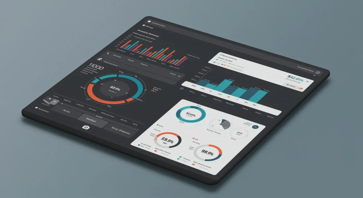
A clear visual summary lets teams spot issues and act before problems escalate. A business dashboard is a visual tool that gathers key metrics and performance indicators into one interactive view. It translates complex data into charts, scorecards, and simple signals that stakeholders read at a glance.
By presenting information in a single view, it removes the need to flip between spreadsheets, CRM screens, and disconnected reporting tools. That convergence reduces friction and cuts the time needed to get to answers.
Real-time vs. historical reporting
Real-time monitoring is for fast operational response — shipping issues, live campaigns, or service queues. Historical reporting supports trend analysis, planning, and performance reviews over weeks or quarters.
Interactive analytics features like filters and drill-downs turn static reporting into exploration. Teams can isolate anomalies, confirm root causes, and avoid acting on stale information.
- Defines metrics so everyone trusts the numbers.
- Reduces report lag and prevents decisions based on old data.
- Prepares the guide’s use cases for sales, marketing, operations, and executives.
Key Features to Look For in Modern Dashboard Software
Modern teams need tools that push live metrics to decision-makers, not just static reports. The right software must keep data current so teams react faster and with confidence.
Must-have capabilities
Live connections support real-time monitoring. They eliminate manual refreshes and reduce lag between an event and action.
Integration should span CRM, social media, spreadsheets, and BI tools so one consistent layer feeds all views.
Interactive visualizations—filters, click-to-drill, and on-chart segmentation—help users move from “what happened” to “why it happened” without exports.
Customizable views let different users and teams see tailored KPIs and metrics that support their daily decisions.
Advanced alerts and notifications detect anomalies and send email, mobile, or wallboard notices when thresholds break.
Export and sharing options—PDFs, live links, TV displays, and email digests—fit common workflows and keep stakeholders aligned.
| Feature | Why it matters | Typical outputs |
|---|---|---|
| Real-time monitoring | Speeds response to changes | Live charts, streaming metrics |
| Data integration | Unifies CRM, social media, spreadsheets, BI | Single source of truth, consistent metrics |
| Interactive visualizations | Enables root-cause exploration | Filters, drill-downs, annotated charts |
| Custom views | Prevents one-size-fits-all reporting | User-specific layouts, role-based widgets |
| Share & export | Matches how teams distribute insights | Email digests, PDFs, TV/wallboard links |
Why Business Dashboards Matter for Performance and Decisions
Quick visual summaries let teams see emerging patterns before they become costly problems. A well-designed business dashboards setup flags trends and outliers early, lowering the risk that small issues erode business performance.
Spotting trends, patterns, and outliers
At-a-glance visuals highlight upward or downward trends so teams catch anomalies fast.
That speed reduces downtime and keeps KPIs on track.
Streamlining communication across executives and frontline teams
Clear charts create a single source of truth. Executives and frontline staff see the same insights, which tightens decision-making and shortens review cycles.
Improving collaboration and data accessibility
Shared definitions and common views cut debate over “whose numbers are right.”
Live data access also spreads insight beyond analysts, boosting team data literacy and freeing time for action instead of reconciliation.
- Fewer status meetings spent reconciling spreadsheets.
- Faster operational responses during campaigns or supply swings.
- More time devoted to strategic decisions and follow-up.
Business Dashboards and KPI Strategy That Actually Works
Choosing the right indicators starts with asking what decision each number will inform. A clear link between a goal and a KPI stops teams from chasing easy-to-pull figures that don’t move outcomes.
Choosing KPIs that reflect goals, not just easy-to-pull metrics
Start with objectives and pick a few meaningful kpis. Fewer, focused measures keep views actionable and reduce noise.
Balancing leading vs. lagging performance indicators
Mix predictive signals with result-focused ones. Leading indicators prompt immediate action while lagging performance indicators provide accountability later.
Building metric definitions the whole team can trust
Standardize formulas, time windows, and inclusion rules. Clear definitions prevent disputes, improve trust, and speed routine reviews.
- Weekly checks for operations.
- Monthly planning to adjust tactics.
- Quarterly reporting for executive alignment.
| Practice | Why it matters | Outcome |
|---|---|---|
| Limit KPIs | Reduces clutter | Faster decisions |
| Define formulas | Builds trust | Fewer disputes |
| Balance indicators | Supports action and review | Improved performance |
When teams apply these strategies, dashboards become decision systems that deliver timely insights for business leaders.
Business Dashboard Types and When to Use Each
Matching view type to decision frequency is the fastest way to reduce noise and speed action. Selecting the right dashboard depends on audience, cadence, and required detail.
Operational dashboards for day-to-day operations
Operational dashboards show live KPIs for frontline teams and managers. They update often so staff can fix issues before they escalate.
Strategic dashboards for executives and long-term goals
Strategic dashboards present high‑level metrics for executives. They track company health against long-term goals and inform quarterly decisions.
Tactical dashboards for mid-term planning and initiatives
Tactical dashboards bridge strategy and operations. Department leads use them to monitor initiatives and adjust resources over weeks or months.
Analytical dashboards for deeper insights and root-cause analysis
Analytical dashboards are for analysts who need drill-downs and segmentation. They expose patterns that support complex decisions and testing.
- Choose by decision frequency: real-time for ops, periodic for strategy.
- Choose by audience: simple views for managers, rich views for analysts.
- Choose by granularity: high-level KPIs for executives; detailed logs for investigations.
| Type | Main User | Primary Use |
|---|---|---|
| Operational | Managers | Fix incidents, monitor queues |
| Strategic | Executives | Track long-term goals |
| Tactical | Department leads | Plan initiatives |
| Analytical | Analysts | Root-cause analysis |
Dashboard Examples by Department to Model Your Build
Clear, role-specific examples show what metrics each team needs and why those numbers matter. The list below gives compact templates teams can copy and adapt.

Sales
Include revenue, pipeline stages, regional performance, and conversion rate. Show pipeline velocity and deal size to guide prioritization and quota adjustments.
Marketing
Unify channel spend, conversions, and attribution models to link digital marketing activity to revenue. Track campaign ROI and top-performing creative.
Finance
Surface cash flow, profit margins, and working capital trends. Add burn rate and forecast variance to flag solvency risks early.
HR
Track turnover, time-to-fill, and recruiting funnel conversion. Add performance ratings and retention risk signals for proactive staffing decisions.
IT
Monitor cloud workloads, incident trends, and mean time to resolution to reduce support tickets and lower downtime.
Call center
Display live service metrics: queue length, average handle time, and customer satisfaction so leaders can act before issues escalate.
| Department | Key Metrics | Primary Decision |
|---|---|---|
| Sales | Revenue, pipeline stages, conversion rate | Prioritize deals, set quotas |
| Marketing | Channel ROI, attribution, conversions | Allocate spend, optimize campaigns |
| Finance | Cash flow, margins, forecast variance | Manage liquidity, adjust forecasts |
| HR | Turnover, time-to-fill, performance | Staffing plans, retention actions |
| IT | Cloud utilization, incident trends, MTTR | Reduce tickets, improve uptime |
Business Dashboard Examples by Industry and Use Case
Every sector has its own signal set; the right view exposes what to fix and when. The examples below show common setups and the KPIs teams rely on to act fast.
Retail
Retail views provide a near real-time snapshot of inventory, sales trends, and online performance.
Teams use these to avoid stockouts, prioritize replenishment, and tune promotions.
Healthcare
Healthcare panels consolidate patient data for visibility and care planning.
This reduces time spent chasing records and supports safer, personalized treatment paths.
Telecommunications
Telecom monitoring tracks latency, signal strength, and call drops.
These metrics help pinpoint coverage problems and protect the customer experience.
Manufacturing
Manufacturing layouts focus on downtime, throughput, and cost control.
That focus reduces waste and improves operational profitability.
SaaS
SaaS setups unify cross-team metrics from sales, marketing, finance, and support.
Executives get a single operational narrative to guide priorities and resource management.
- Note: Industry views differ mainly by KPIs and decision cadence, not by core design and governance principles.
| Industry | Core KPIs | Primary Use |
|---|---|---|
| Retail | Inventory, sales, online conversion | Avoid stockouts, optimize offers |
| Healthcare | Patient records, care metrics, wait times | Improve care planning and safety |
| Telecom | Latency, signal, call drops | Protect network and customers |
Mapping Goals to the Right Dashboard View
Pick a view that matches the immediacy of your goals — short-term fixes or long-term growth.

Short-term objectives and simple web analytics dashboards
For near-term monitoring, teams use simple web analytics dashboards that show direct signals. These views focus on traffic sources, page views, sessions, and bounce rate.
They also include conversion rate, demographics, and goal completions. That mix helps teams act in time on campaigns, landing pages, or traffic shifts.
Long-term optimization with sophisticated web analytics and revenue alignment
Sophisticated analytics merge multiple data sources to connect marketing to revenue. They blend CRM, social, and spreadsheets with site metrics to show campaign impact.
These views support long-term strategies like funnel optimization, lifetime value, and channel attribution. They help align teams around revenue outcomes, not just clicks.
Why mapping matters: Start from the decision you need to make. That prevents building a comprehensive-looking view that fails to support action.
- Use templates when goals and audience are clear to speed deployment.
- Still define KPIs precisely so templates don’t mask data gaps.
- Choose tools that let users switch from executive overview to deeper analysis without duplicate reports.
| Goal Horizon | Typical Metrics | Primary Advantage |
|---|---|---|
| Short-term | Traffic sources, sessions, bounce rate, goal completions | Fast reactions to campaign or UX issues |
| Long-term | Attribution, CRM revenue, LTV, multi-source funnels | Aligns marketing with revenue and strategy |
| Hybrid | Executive KPIs + drill-down web metrics | One view for leaders and analysts |
Best Practices for Dashboard Design and Visualizations
Design choices should let someone scan a view and leave with one clear action in five seconds. That rule forces priority: show the single most important signal first, then supporting context. Clear hierarchy reduces argument and speeds action.
Apply the five-second rule for at-a-glance clarity
Place the top KPI where eyes land first. Use size, contrast, and short labels so stakeholders grasp the key information without explanation.
Reduce clutter by limiting KPIs and using whitespace
Limit visible KPIs to what directly supports the decision at hand. Excess items dilute attention and create noise.
Whitespace groups elements and improves scan speed. A simpler layout lowers cognitive load for users and improves reporting adoption.
Choose the right chart types for metrics and trends
Use line charts for trends, bar charts for comparisons, and heatmaps when density or correlation matters. Match chart choice to the question, not the data alone.
Consistent color palettes and accessible contrast
Stick to about three brand colors and a clear semantic palette for up, down, and neutral. Check contrast for readability on laptops, phones, and wall displays.
Add interactivity without overwhelming users
Offer filters and drill-downs via progressive disclosure. Set sensible defaults so casual viewers see the right slice and analysts can explore deeper.
Tie design to performance: Well-designed visualizations and a clean dashboard shorten time from insight to action and improve overall performance.
| Design Area | Principle | Practical Tip |
|---|---|---|
| Hierarchy | One primary signal | Large card at top-left with concise label |
| Clarity | Limit KPIs | 3–7 metrics per view; group related items |
| Charts | Match to question | Line = trends; Bar = compare; Heatmap = density |
| Color | Consistency & contrast | 3-color palette; WCAG contrast check |
| Interactivity | Progressive disclosure | Defaults + optional filters and drill-downs |
How to Create a Business Dashboard from Scratch
Start by naming the single decision the view must support and who will act on it. That focus keeps the design tied to outcomes and prevents feature creep.
Set objectives and define the audience. List the decisions the dashboard must enable. Note the cadence (real-time, daily, weekly) and who needs access: execs, managers, or analysts.
Select KPIs and metrics that align with goals. Pick a small set of measures that directly inform those decisions. Choose leading indicators for immediate action and lagging metrics for accountability.

Identify and consolidate data sources
Look beyond Google Analytics: include CRM records, finance systems, ad platforms, and spreadsheets when appropriate. Map each source to the KPI it supports.
Integrate, clean, and standardize data
Merge feeds, remove duplicates, and align time windows and definitions. Standardization prevents conflicting numbers and builds trust in reporting.
Design, test with stakeholders, and iterate
Build a quick prototype, validate it with users, and refine layout and labels. Repeat until the view answers the core decision quickly and reliably.
- Define objective & audience.
- Choose KPIs tied to goals.
- Catalog data sources and map fields.
- Clean, integrate, and validate data.
- Prototype, test, and iterate.
| Phase | Key activity | Deliverable | Common pitfall |
|---|---|---|---|
| Plan | Define decisions and users | Objective brief and audience list | Vague goals that diffuse focus |
| Measure | Select kpis and metrics | Metric catalog with formulas | Picking easy-to-pull metrics over useful ones |
| Data | Integrate and clean sources | Validated dataset and mapping | Unstandardized fields causing mismatches |
| Build | Design, test, iterate | Working prototype and rollout plan | Skipping stakeholder testing |
Choosing Tools, Templates, and Platforms for Dashboards
Picking the right toolset starts with needs: determine whether the goal is fast deployment, deep analysis, or strict governance. Teams that know their KPIs and cadence can move quickly with pre-built templates and avoid long build cycles.
When pre-built templates speed up deployment
Templates help most when KPI definitions are finalized and teams want consistent layouts across views. They cut design time, enforce naming standards, and provide repeatable structures for departmental rollouts.
Use templates for pilot dashboards, executive rollups, and recurring reports. Reserve custom builds for specialized analytical needs.
Must-have capabilities for analytics tools in the US market
- Strong integrations to CRM, ad platforms, databases, and lakes.
- Scalable refresh rates: from live streams to nightly batches.
- Governed metric layers that lock formulas and definitions.
- Flexible sharing options for reports, links, and exports.
Evaluating BI platforms: usability, governance, and scalability
Assess platforms for adoption (easy self-service), trust (centralized metric management), and scale (concurrent users and large datasets). Market credibility counts; for example, analyst recognition like Gartner leadership and strong KPI rankings (notably Qlik Sense) signal maturity.
| Criterion | What to test | Why it matters |
|---|---|---|
| Usability | Drag-and-drop, templates, user training | Faster adoption and fewer support tickets |
| Governance | Metric catalog, role controls, audit logs | Trust in numbers and fewer disputes |
| Scalability | Data model size, concurrent users, refresh modes | Supports growth without rebuilds |
| Integration | Prebuilt connectors, API access, ETL support | Consolidates data from multiple systems |
Match tool choice to requirements: choose real-time platforms for live monitoring, batch systems for periodic reporting, and consider compliance needs for data residency and access control. Favor platforms that can deliver executive rollups and departmental deep dives without rebuilding core reports.
Operationalizing Dashboards Across Teams
Turning dashboards into daily routines depends on role clarity and simple reporting rhythms. Clear responsibilities help the company act on real-time information.
Define roles and responsibilities.
Executives, managers, and frontline users
Executives monitor outcomes and remove blockers. Managers control levers and assign follow-up. Frontline users act on immediate signals and escalate issues.

Sharing and reporting workflows
Schedule summaries that fit existing rhythms: daily email digests, meeting live links, and always-on TV or wallboard views. Include PDF snapshots for archived reporting and audits.
Establishing a single source of truth
Governed metric definitions and a consistent data model prevent version conflicts. Control changes through a metric catalog and change logs so everyone trusts the numbers.
- Align access so teams see the right level of detail.
- Use rituals—daily standups, weekly reviews—to embed use.
- Track adoption: a dashboard only delivers value when it guides decisions and follow-through.
| Role | Main Action | Output |
|---|---|---|
| Executive | Monitor outcomes | High-level scorecards |
| Manager | Adjust levers | Operational reports |
| Frontline user | Act on signals | Immediate alerts |
Keeping Dashboards Accurate, Secure, and Up to Date
Accurate, timely views start with clear refresh rules and strict data hygiene. Decide refresh frequency by use case: live streams for call center monitoring; scheduled nightly or monthly refreshes for finance closes.
Refresh cadence and live connections
Live connections prevent stale reporting when teams make real-time decisions. Scheduled pulls reduce load for heavy financial extracts and avoid unnecessary costs.
Match cadence to the decision horizon so the dashboard reflects the right time window.
Data quality and validation
Follow a short checklist: deduplicate records, enforce consistent naming, align time zones, and validate totals against the system of record.
Permissions, access, and stakeholder trust
Apply role-based access so sensitive information stays protected while most users get appropriate visibility.
Earn trust through transparent definitions, audit logs, and predictable refresh behavior.
Operational monitoring
Use monitoring tools to alert on broken connectors or failed refreshes before leaders spot gaps. Regular checks keep reporting reliable and teams confident in the information they use.
| Area | Key action | Benefit |
|---|---|---|
| Refresh | Live vs scheduled | Right cadence for decisions |
| Quality | Deduplication & validation | Accurate metrics |
| Access | Role-based controls | Protected sensitive data |
Trends Shaping Business Dashboards Right Now
AI and natural-language features are turning routine reporting into instant, context-aware guidance for teams.
AI-assisted insights and anomaly detection
AI-assisted insights push views from passive reports to proactive monitors that flag risks and opportunities. Anomaly detection highlights outliers and suggests next steps so teams react faster.
Natural-language analytics and self-service
Natural-language questions let nontechnical users ask plain queries and get answers without SQL. Self-service analytics speeds team-led decisions while raising the need for governance and trusted metrics.
Always-on, interactive performance views
Static reports are giving way to live, interactive views used in meetings, ops centers, and executive check-ins. These continuous views keep performance visible and decisions timely.
Real example: Austin Capital Bank used an AI search-driven tool daily to track leads and conversions, improving revenue margin by ~30% and cutting paid search spend by 50%.
| Trend | Impact | Tool needs |
|---|---|---|
| AI insights | Faster anomaly detection | Model explainability, audit logs |
| Natural-language analytics | Wider user adoption | Semantic layer, query safety |
| Always-on views | Continuous operational awareness | Integrations, automation, secure sharing |
Conclusion
Consolidated views turn scattered metrics into a single operational signal teams use every day.
Start with the decision: define goals, pick a few kpis, build a clean data foundation, then design for clarity. A focused business dashboard keeps attention on immediate actions and long-term tracking.
Use the dashboard examples in this guide as templates for sales, marketing, finance, and service teams. Adapt layouts and metrics to fit each audience and the customer journeys that matter most.
Choose templates and tools that match maturity, integrations, governance, and scale. Prioritize platforms that make sharing simple (email, PDF, live links, TV) and that lock metric definitions.
Next step: audit current reporting, pick the highest-impact view to build first, and iterate with stakeholders. Well-governed views reduce confusion, speed decisions, and create a shared performance language across the company.
FAQs
>What is a business dashboard and how does it improve business performance?
A business dashboard is a visual command center that consolidates key metrics into one real-time view. It improves business performance by helping teams detect trends early, respond faster to risks, and align daily actions with company goals.
How do dashboards help digital marketing teams make better decisions?
Dashboards unify traffic, conversion, and campaign data across platforms so digital marketing teams can see what is driving revenue, optimize spend, and react quickly to performance changes without waiting for manual reports.
Which dashboard examples are most useful for growing businesses?
The most useful dashboard examples include sales dashboards for pipeline tracking, marketing dashboards for campaign ROI, finance dashboards for cash flow and forecast variance, and support dashboards for response time and customer satisfaction.
How does a business dashboard improve customer experience?
A business dashboard helps teams monitor service queues, response times, and customer satisfaction in real time. This allows faster issue resolution, better resource allocation, and more consistent service delivery across teams.